
The Complete Introduction To Power BI
Visually explained what Power BI is, its history, components, ecosystem, who uses it, and why companies rely on it

Hey friends - Happy Tuesday!
I’m really excited to share this with you. I’ve officially started working on my new PowerBI Course!
Power BI is one of the most requested courses on my channel, and for a good reason.
This is the tool I have used since 2019 on real projects at Mercedes Benz and now It is time to share everything I learned in my projects with You. The small things. The decisions. The mistakes. The parts that actually matter when you work with real data.
So as usually I explain things using animated sketches. So Let’s go!
Power BI is one of the most requested courses on my channel, and for a good reason. It sits right between the business world and the technical world. If you understand it well, you can answer real questions, guide teams, and build reports that people trust.
This post gives you the full picture. What Power BI is, why it exists, who uses it, where it shines, and where it falls short.
So.. Let’s GO!
1. The Chaos - Without BI

Before a company grows, everyone tries to answer business questions in the same simple way. Managers want to understand why sales dropped, which region is struggling, or where they should invest next, and they ask the data analyst to find the answers.
The analyst starts the usual way. They export the data into Excel, clean it, fix the mistakes, merge the sheets, and try to build something that explains what is going on.
It works in the beginning, but once the company grows, the process starts falling apart. Different departments create their own files. Each version is slightly different. Reports take days or even weeks. The data inside becomes old fast. And managers end up making decisions based on numbers that no longer match the reality of the business.
Here are the core problems teams run into:
Everything is manual and depends on repeated human work.
Reports become outdated as soon as they are finished.
There is no automatic refresh, so every update is done by hand.
Connecting to modern sources like cloud systems or APIs is difficult.
Large datasets cause Excel to slow down, freeze, or crash.
Teams cannot collaborate in one file and end up with many versions.
Sharing files puts sensitive data at risk.
There is no access control, so everyone sees everything.
Different teams create different numbers, so managers get conflicting answers.
At this point companies start to realize they need a better system (BI) to handle their data.
What Business Intelligence (BI)
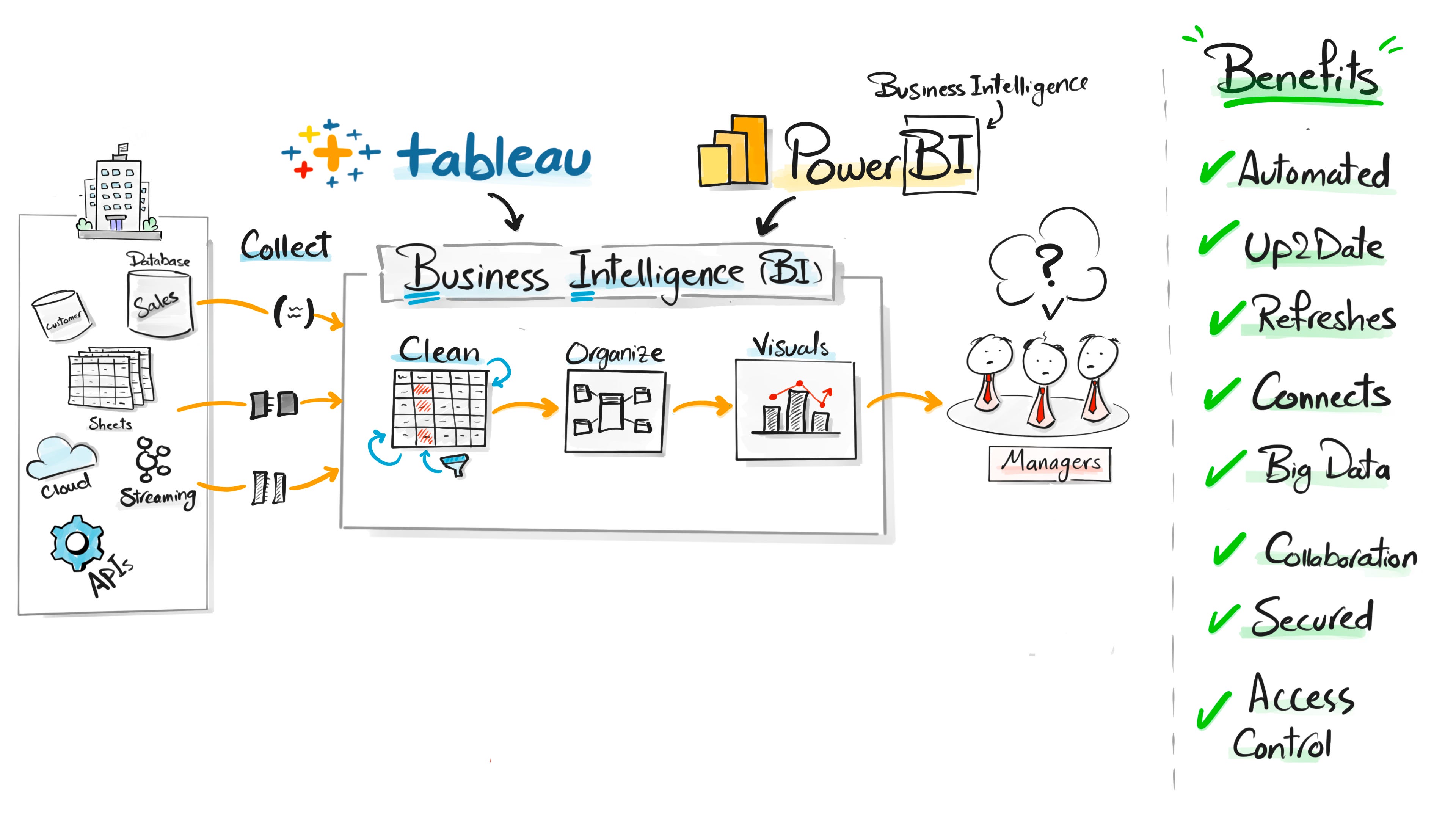
Once you see this chaos a few times, you start to understand why companies move away from spreadsheets. They cannot run a business like this. They need a standard process. Something reliable.
That process has a name. Business Intelligence. Or BI.
BI is not just charts. It is the full chain.
Collecting the data. Cleaning it. Structuring it. Building logic on top of it. Turning it into something people can understand. And then publishing it so others can use it to make decisions.
This full workflow is BI.
Power BI and Tableau are two of the major tools that support this process.
Most people only see the dashboards. But the real work happens behind the scenes.
The History Behind Power BI
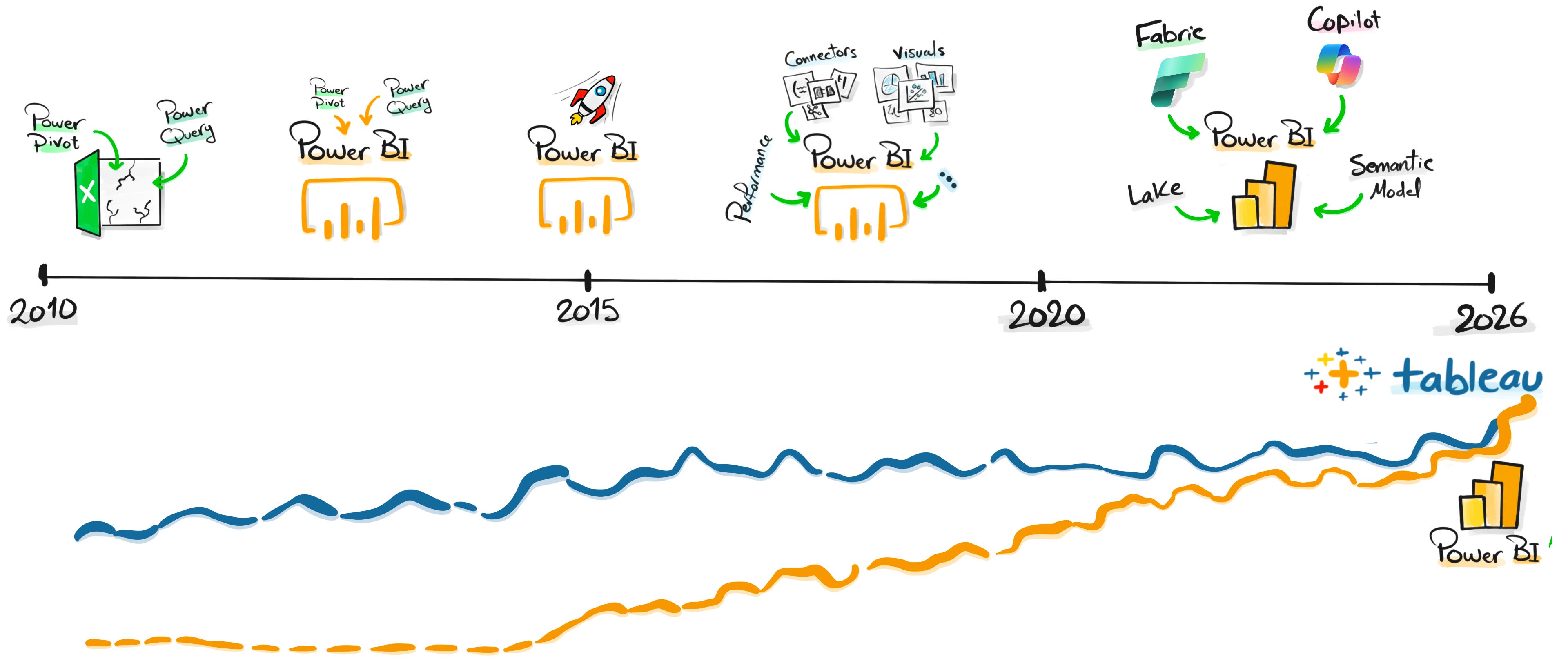
Here is the same clean bulletpoint list, now with dates added where historically accurate and still keeping your simple, direct tone:
Early 2000s: Excel already had strong internal tools like Power Query and Power Pivot, but they were hidden and not widely used.
2010 to 2013: Tableau started rising fast and became popular because it made data visualization simple and clear.
2013 to 2014: Microsoft realized Excel could not handle modern data loads, cloud sources, or large models, and that they needed a new standalone analytics product.
2014: Microsoft began rebuilding the strongest parts of Excel into a separate tool focused on data analysis.
July 2015: Power BI officially launched as a standalone BI platform.
2015 to 2019: Power BI grew month after month with new visuals, connectors, modeling features, and tighter integration with the Microsoft ecosystem.
2020 to 2021: Power BI became a major competitor to Tableau, especially in enterprise environments.
2023: Microsoft introduced Microsoft Fabric and Copilots, expanding Power BI into a larger analytics platform.
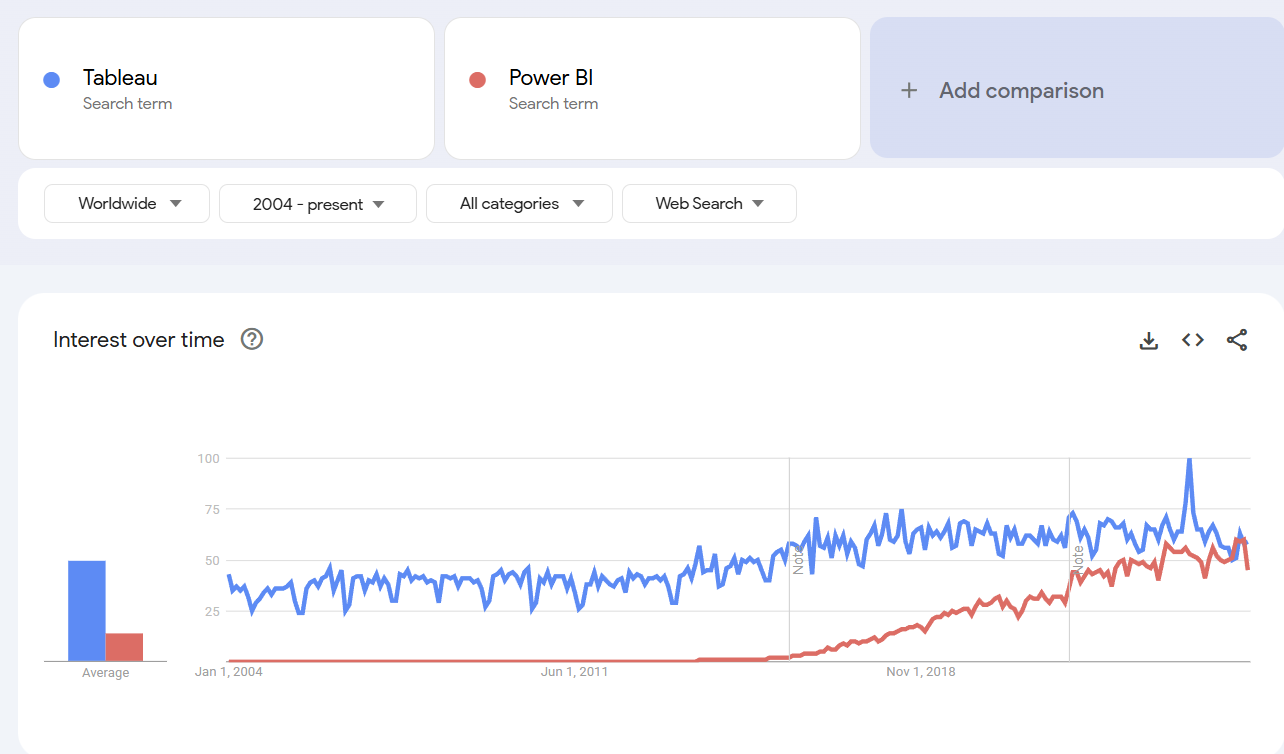
Today: Google Trends shows Power BI nearly matching Tableau in global interest, reflecting a real shift in how companies handle data and build analytics workflows.
What is Data Visualization?

Raw data is hard to understand on its own. A table full of numbers looks flat, and your brain has to work hard to make sense of it. But once you turn that same data into visuals, everything changes. A chart can show a trend in a second. A map can highlight a pattern you never noticed. And a simple shape can reveal a problem that was buried inside rows of numbers.
The reason is simple. Our brain processes visuals much faster than text. When you see an image, you understand it instantly. But when you read a word, your brain first has to convert it into a picture before it makes sense. That extra step slows everything down. This is why we remember only a small part of what we hear, a bit more of what we read, and almost everything we see.
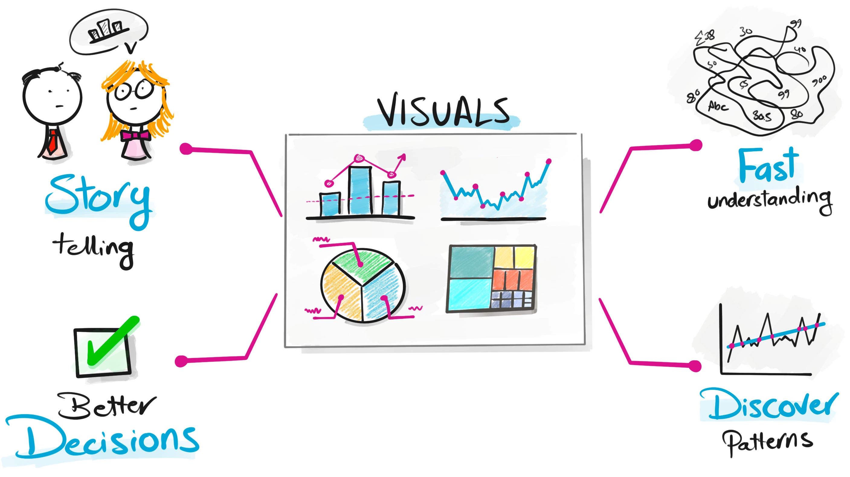
Good visuals are not just nice to look at. They help you explain your ideas with clarity. They make complex topics easier to follow for people who are not technical. They help you spot patterns, risks, and opportunities that are impossible to see in raw tables. And they support better decisions because everyone sees the same story in front of them.
This is the real power of data visualization. It turns information into something people can understand, remember, and act on.
The Components of Power BI
Power BI looks simple from the outside, but it is built on five clear steps that connect the whole analytics workflow. Each part has its own job, and you use all of them in almost every project.
1. Power Query
This is where everything starts. You clean the data, fix the errors, remove duplicates, and prepare the tables so they are ready to work with.
2. Modeling
After the data is clean, you structure it. You connect the tables, define relationships, and build the model that keeps everything accurate and fast.
3. DAX
Here you write the calculations. Metrics, KPIs, percentages, comparisons. DAX creates the business logic that the visuals depend on.
4. Visuals
This is the first part people actually see. You turn the model and the logic into charts, cards, tables, and filters so the story becomes clear.
5. Share
When the report is ready, you publish it so managers and teams can view it in the browser, on their phone, or inside their daily tools.
These five steps cover the full journey. You bring the data in, clean it, structure it, analyze it, visualize it, and share it in one flow.
Ecosystem of Power BI
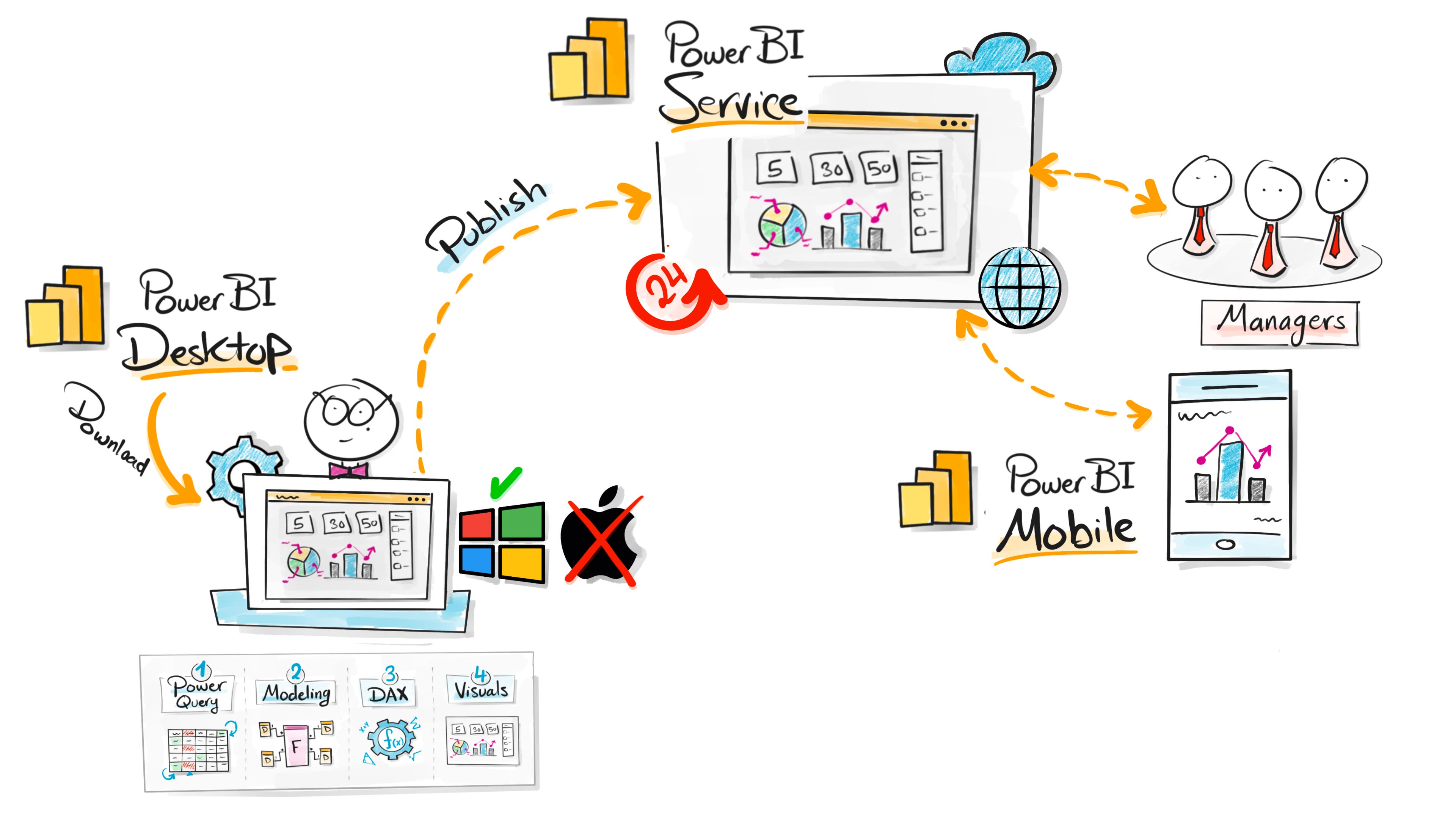
Power BI is not just one tool. It is a small ecosystem, and each part plays a different role in how reports are created, published, and used inside a company.
Power BI Desktop
This is where the work happens. You clean the data, build the model, write DAX, and design the visuals. It runs on Windows, and this is the app you use to create the actual report.
Power BI Service
Once the report is ready, you publish it to the cloud. This is where your dashboards live. Teams open them in the browser, interact with the visuals, and check the numbers whenever they need to.
Power BI Mobile
Managers and decision makers can open the same dashboards on their phones or tablets. It is the fastest way for them to stay updated without opening a laptop.
Together, these three parts create one simple flow.
You build the report on your computer, publish it to the cloud, and teams across the company can view and use it from anywhere.
Who Uses Power BI
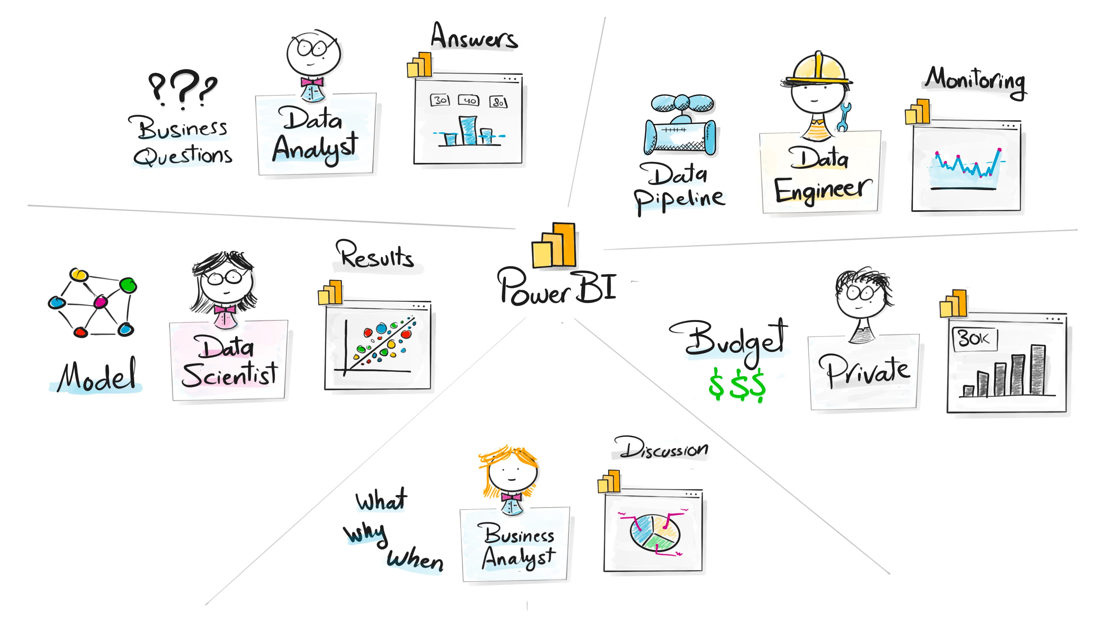
Power BI is not only for data analysts. It is used across many roles, each for a different reason.
Data Analysts
They use Power BI to answer the main business questions. Why something happened, where the problem is, and what the numbers are telling the team.
Data Engineers
They use it to monitor pipelines, check data quality, and make sure everything is running the way it should.
Data Scientists
They use Power BI to present their model results in a simple way that non technical teams can understand.
Business Analysts
They use it during discussions with stakeholders to explain what happened, why it happened, and what might come next.
Managers and Leaders
They use it to check performance, budgets, and key metrics without digging through raw data.
Individuals
Many people even use Power BI privately at home to track spending, budgets, or personal projects.
Power BI fits any situation where you have numbers and you want to understand the story behind them.
Why Power B

There are many BI tools out there, but Power BI keeps showing up in real companies for a few clear reasons.
It fits into your daily tools
Most people already use Outlook, Teams, Excel, SharePoint, and PowerPoint. Power BI feels natural because it works the same way and connects to everything without extra steps.
It is affordable
Licenses cost less than most alternatives. For companies trying to reduce software expenses, this alone is a strong reason to choose it.
Easy to switch from Excel
If you know Excel, you already understand a big part of Power BI. The transition is simple because the concepts and the interface feel familiar.
Everything in one place
Data cleaning, modeling, DAX, and visuals all live inside the same tool. You do not need separate apps to prepare or analyze the data.
Continuous updates
Microsoft pushes new visuals, connectors, and features every month. The tool grows fast and adapts to new workflows, including AI features.
Strong data modeling
Power BI gives you a powerful modeling layer. This makes your reports faster, more flexible, and easier to maintain when the data becomes complex.
These are the practical reasons why so many teams choose Power BI for their analytics work.
Power BI Is Not Perfect!
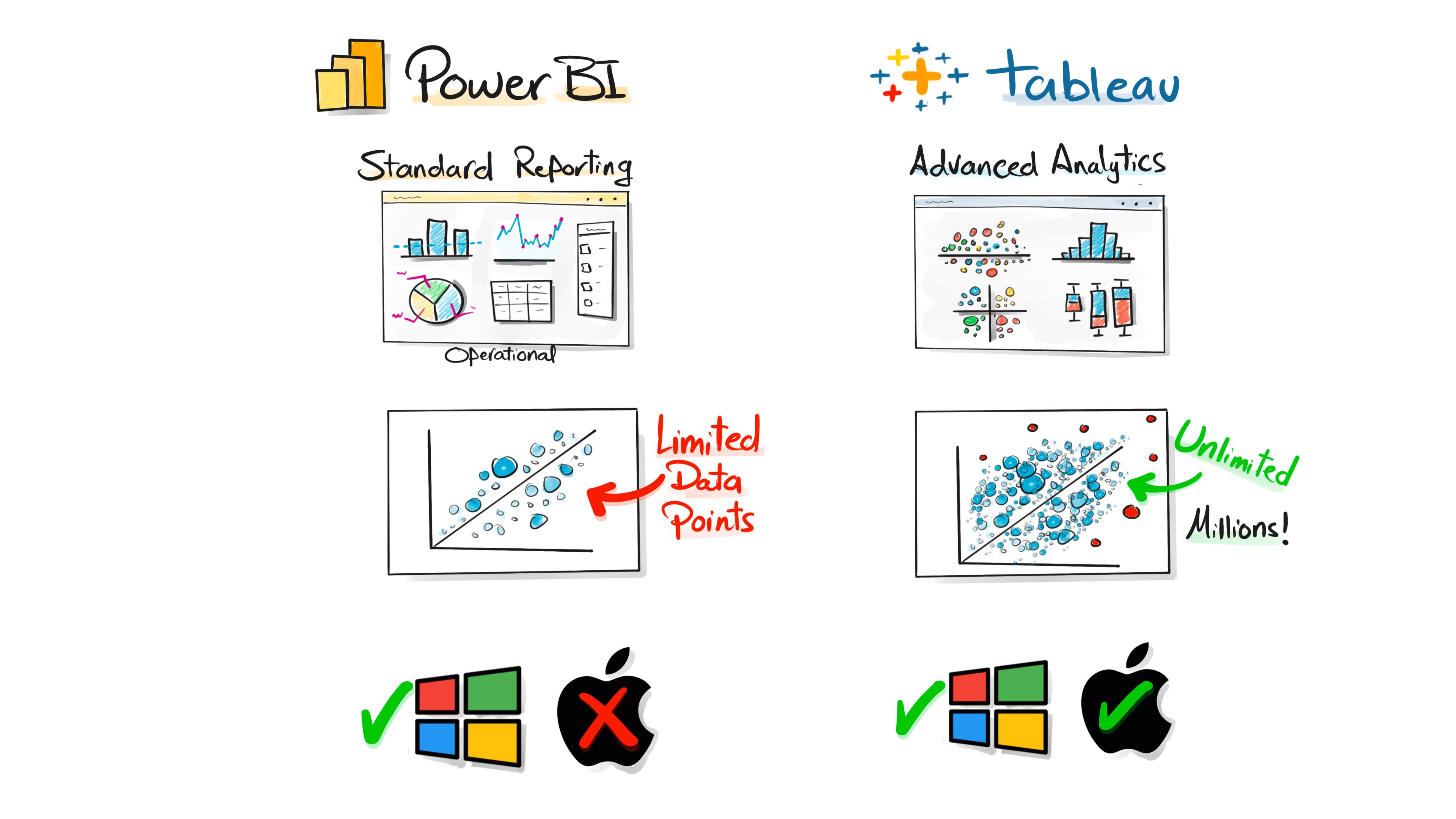
Power BI is great for most reporting needs, but it is not perfect. There are a few situations where another tool, like Tableau, works better.
Limited for advanced analytics
Power BI is strong for standard operational reports, but it struggles with more complex analytical visuals that data scientists or advanced analysts often need.
Limits on data points
Scatter plots in Power BI can only show a limited number of points. If you want to display hundreds of thousands or even millions, the tool cannot handle it.
Tableau handles big visuals better
Tableau does not enforce these limits. You can load very large visuals with millions of data points and still explore the patterns clearly.
Desktop only on Windows
Power BI Desktop does not run on Mac. You need workarounds. Tableau works on both Windows and Mac without extra steps.
These are the practical situations where Power BI falls short and where teams often choose Tableau for the more advanced parts of their work.
So my Friends…
If you understand this much about Power BI, you already see why companies rely on it every day. It organizes the chaos, makes the data usable, and gives teams a single place to understand what is really happening.
We will go deeper in the next lessons. Desktop, DAX, modeling, real examples, and the practical workflow that actually works in a real job.
Thanks for reading. ❤️
Baraa
Also, here are 3 complete roadmap videos if you’re figuring out where to start:
📌 Data Engineering Roadmap
📌 Data Science Roadmap
📌 Data Analyst Roadmap
📌 AI Engineering Roadmap

Hey friends —
I’m Baraa. I’m an IT professional and YouTuber.
My mission is to share the knowledge I’ve gained over the years and to make working with data easier, fun, and accessible to everyone through courses that are free, simple, and easy!
Wow this is the most comprehensive post about Power BI I’ve seen!
Now I’m starting to study it, and coming from creating dashboards on Excel, I hope it won’t be too hard
Hi Mr. Braa
Thank you so much for sharing this .